Press X To Immerse
Immersion in video games has become a big talking point among fans and critics lately. Having recently completed the excellent Metro 2033 series (I know, a little late on that) I thought I would share my thoughts on some recent trends. In particular – button prompts, disruptive HUDs, and how these two elements can affect a player’s immersion within a game.
IMMERSION
When we talk about immersion in video games, we all have different definitions and examples, but the core of the matter remains. A game that is immersive makes you feel like you are part of that game world.
There is a multitude of ways to create an immersive experience. Perhaps the best indicator that a game has accomplished this task is if the player forget he or she is playing a game. Instead the player feels as though they are inhabiting, navigating, and interacting with the world and characters within the game. What are some easily definable ways to do that?
1) Create controls that feel natural. Make a player forget she is holding a controller or using a mouse and keyboard. Overly complex button combinations or awkward controls create a disconnect between the player and the world.
2) Allow your player to be in control as often as possible. Wresting control away from the player transforms the engaged participant into a detached observer. Avoid this whenever possible, or limit the length of these interruptions to a minimum.
3) Build a world, sustain your tone, and create an atmosphere. If you want your world to be immersive, it has to be believable. That doesn’t mean realistic, but every part of your game should adhere to the game world’s logic.

You race as Mario trying to outwit baby Mario, trying to outrace Metal Mario, trying to outrun Mario in a raccoon suit. This doesn’t make sense even by Mario’s standards.
We have a rough definition of immersion, and some ideas on how video games can create that illusive and unique feeling. So we’ve got that out of the way… now let’s look at two ways recent games have been completely fucking this up.
BUTTON PROMPTS
Now when I’m talking about button prompts I’m talking about this:
Overcomplicated button prompts have been universally mocked and scorned by the video game community. “Press X to Jason” and “Press F to Pay Your Respects” have become punch lines, and rightfully so. Trying to boil down complex actions and emotions to a simple press of a button isn’t only ludicrous, it’s also insulting to the player and ruins the connection he may have with the game.
In the example above we have “Press E to Jump In Mass Grave.” I’m not an expert, but I imagine hiding from lethal enemy soldiers in a pile of corpses on a war-torn battlefield is a harrowing experience. Likely, it’s a mess of violently conflicting emotions, rife with visceral human drama. Homefront doesn’t seem to understand or even respect that idea, because they have boiled down this powerful event (a perfect opportunity for immersion) to a single press of a button. You just need to press ‘E’. When these sort of intense moments are reduced to an effortless button prompt, it’s laughable, the world is broken and the immersion is shattered.
But it doesn’t even have to be that heinous an action to create this issue. There is an inherent disconnect when a game tells me to “PRESS X” to watch my character perform a 30 second long complex animation. Your thoughts may be – ‘So wait, I did that? Just by pressing X?’ When the action performed in game is not proportional to the depth and complexity of the input from the player – it feels wrong. There is a ratio that needs to be preserved or else the immersion breaks down.
Button prompts do further disservice to the atmosphere beyond this inherit disconnect. It begs the question – Who am I in relation to this world? If I’m “pressing F to pay my respects” then I can’t be the avatar on the screen. I’m not the war-torn soldier by the graveside giving a tearful goodbye to his friend. I am Alex, sitting at my computer pressing the F button on my keyboard. After I press ‘F’ I will sit back and watch as my avatar pays his respects. This obliterates the atmosphere set up by the game, bringing up questions of reality and player actions during moments that should be critical to storytelling. In addition, it creates this strange passive observer role for the player that robs them of any real agency.
I’m not saying every game should strive to avoid button prompts, sometimes it’s unavoidable. But nothing hammers home the reality that you are playing a game more than the phrase “Press X to _____”
DISRUPTIVE HUDS
The other major issue I’ve seen crop up in a lot of modern games that destroys immersion – HUDs, or Heads-Up Displays. The idea behind a HUD is a good one. Present the player with the data they need to play the game without having to go to a menu screen, or pause the action. This way your main screen can show you everything you need while you continue to play the game.
It’s an oversimplification to say that game HUDs have universally become more intrusive and offensive. However, on the whole, HUDs have encroached further and further into our games and continue to evolve into more complex and distracting on-screen constants.
As an illustrative point, let’s look at how the HUD has become more complicated and cumbersome in a game series that has remained relatively unchanged in gameplay, The Legend of Zelda.
A Link to the Past – 1991
I’ve got my life bar, my magic bars and the ammo and money counters. Some of this is superfluous, do I need to know how much money I have at all times? No. But okay, fine. It only takes up the top part of the screen, there’s plenty of screen left for me to enjoy my game.
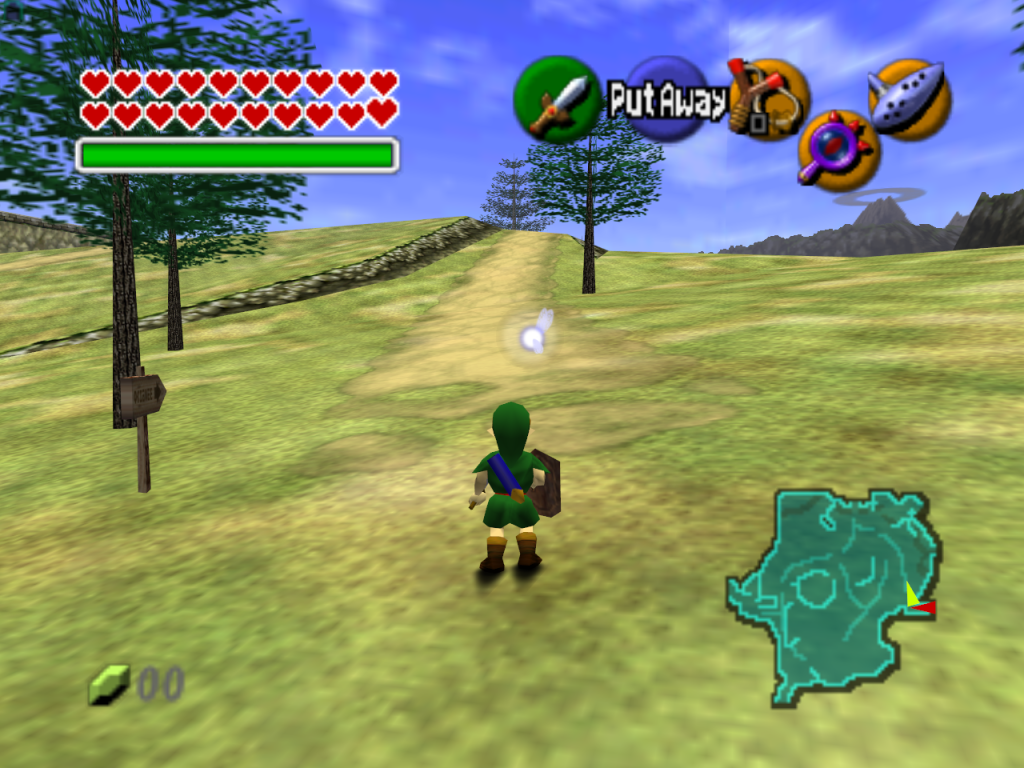
Ocarina of Time – 1998
Wow. Okay, well the top part of the screen is even more bulky, and it seems the HUD has encroached into both bottom corners of my game space too. Well, I guess it’s nice to know what items I have equipped to what buttons, but Jesus, this sure is clunky.
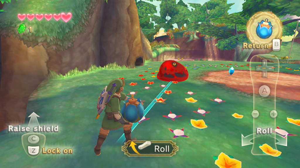
Skyward Sword – 2011
Fuck. There is the OUTLINE of the Wiimote taking up the entire right side of the screen! Acting as a constant reminder – you are holding a controller, you are not the hero, you are only a stooge pressing buttons.
Now I admit this comparison could be considered unfair by many, and yes – I will admit that controllers have become more complicated with more buttons to keep track of. And yes, there are options in Skyward Sword to make the HUD less obtrusive (the image I have shown is the “Standard” interface, there is a “Light” interface that is moderately less offensive). But in my eyes these HUDs have gotten progressively worse. And despite the added buttons and complexities of modern controllers, I still stand by the axiom that controls should be designed in a way that complicated HUDs are not necessary.
Skyward Sword is just one example. An example that perfectly illustrates the main issue with HUDs: they are made for stupid people. Look at the photo of Skyward Sword again – LOOK!
It has 5 different prompts on the screen at once: Press Z to lock on! Shake the Wii-mote to roll the bomb! If you don’t want to throw the bomb you can press B to return to your normal combat stance!!! If you want you can press C to raise your shield!!!! I don’t know why you would, but hey, it’s there if you need it! Did we mention you rotate the Wii controller to roll the bomb!?!?!?
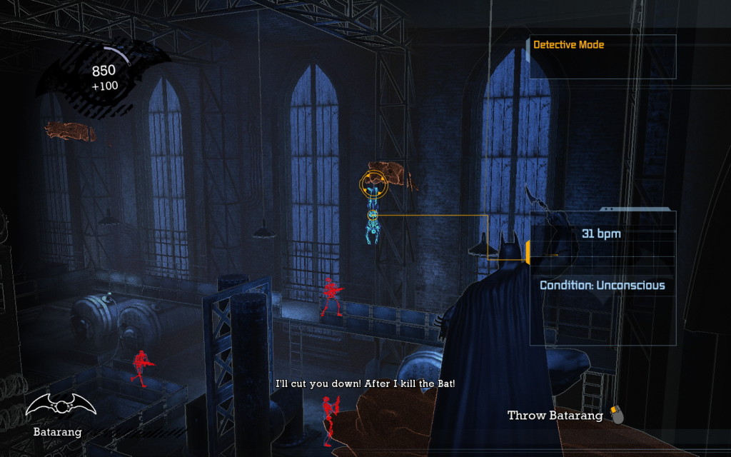
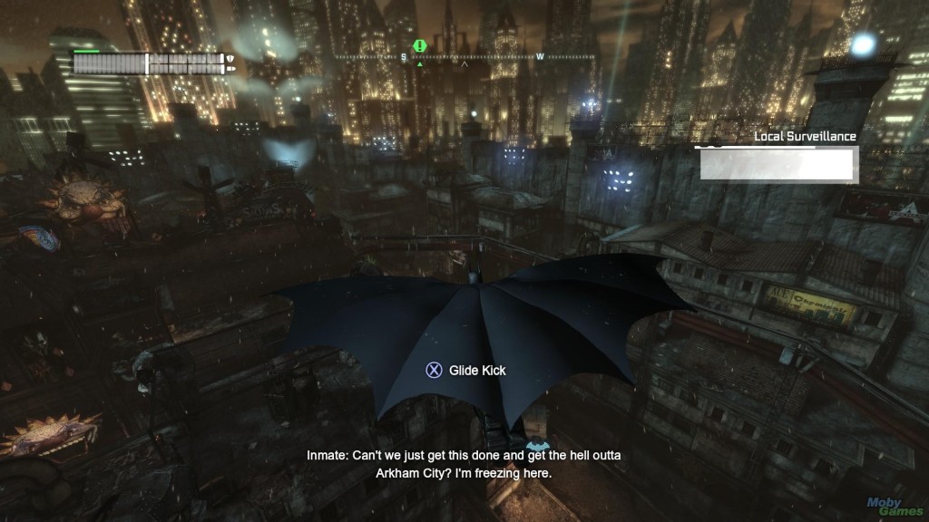
Everyone loved those Batman Arkham games right? Well let’s look at that game:
Hey you’ve got the Batarang equipped. I don’t know if you knew that. I know you are holding up the Batarang in your hand and all… but yeah. Also you click the mouse button to throw it. Also you are in DETECTIVE MODE. That’s why everything is blue and shit.
Why is there so much clutter? Does Batman need to know how to throw his Batarang? No. So this information is for us, the players. But why would the developers assume we need constant reminders of what is happening in the game we are playing? We’re not idiots!
If you have looked at the manual, been through a tutorial, or just played the game for more than 10 minutes, you should know ALL OF THIS INFORMATION ALREADY. These sort of HUDs are demeaning to the player, as if the game creators don’t trust our ability to investigate the game world and decipher how to play in it.
In addition, it fills valuable screen real estate with dull, redundant data that should be used to flesh out the beautiful images that capture the audience. And as far as immersion is concerned – these overlays are a constant reminder of the controller in your hands. Visually enforcing the idea that you are merely a presser of buttons. The HUD creates a literal layer between you and the game world. A thin but perceptible barrier, preventing you from entering the fictional universe.
METRO 2033
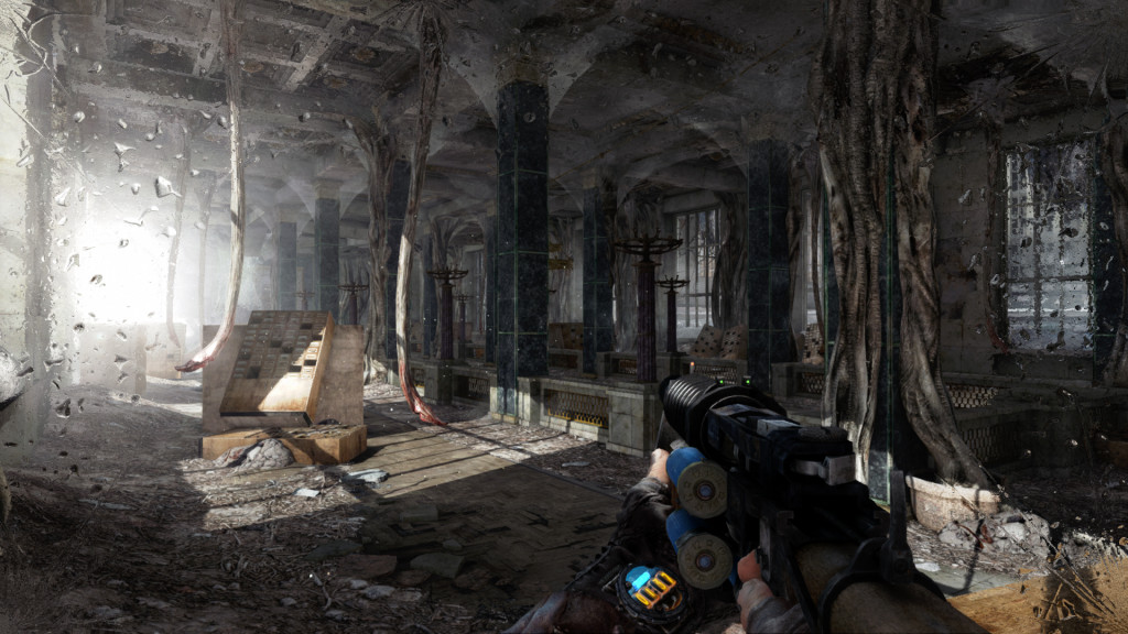
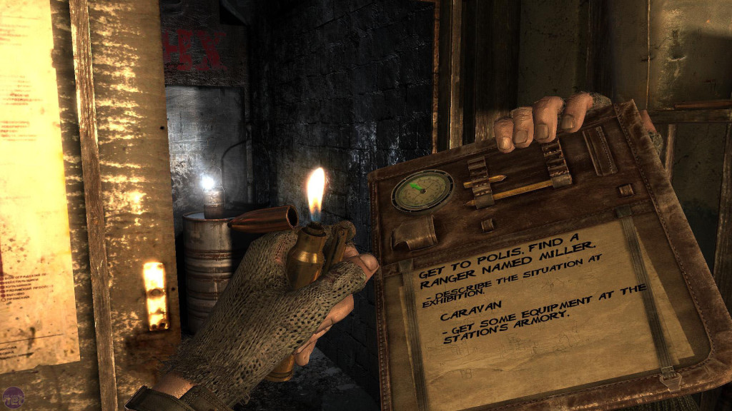
And that brings me back to Metro 2033. The game that prompted this whole article for me. In the game, you play as a young Russian named Artyom, forced underground after a nuclear war has devastated the surface of the earth. The world is in shambles. The landscapes are barren and stark. You explore this simultaneously nightmarish and beautiful vision in first person. Nearly every moment of the game is from this perspective, through the lens of this elegantly simple HUD:
At first it appears there is almost no data, but look closer. The shotgun has it’s bullets clipped to the side. When you reload you place the 6 shells into their chambers. You can keep track in your head of how many shots you have left. The hand holding the gun has a watch. The blue light at the top acts as a stealth indicator. If it’s lit up, you’re noticeable to enemies. If it’s dark – you’re hidden in shadows. Below that – a timer. It shows you how much air you have left in your current gas mask filter. It counts down and will beep when you have to switch filters. Simple and effective. Unobtrusive, and inoffensive while still managing to present you with all the data you need.
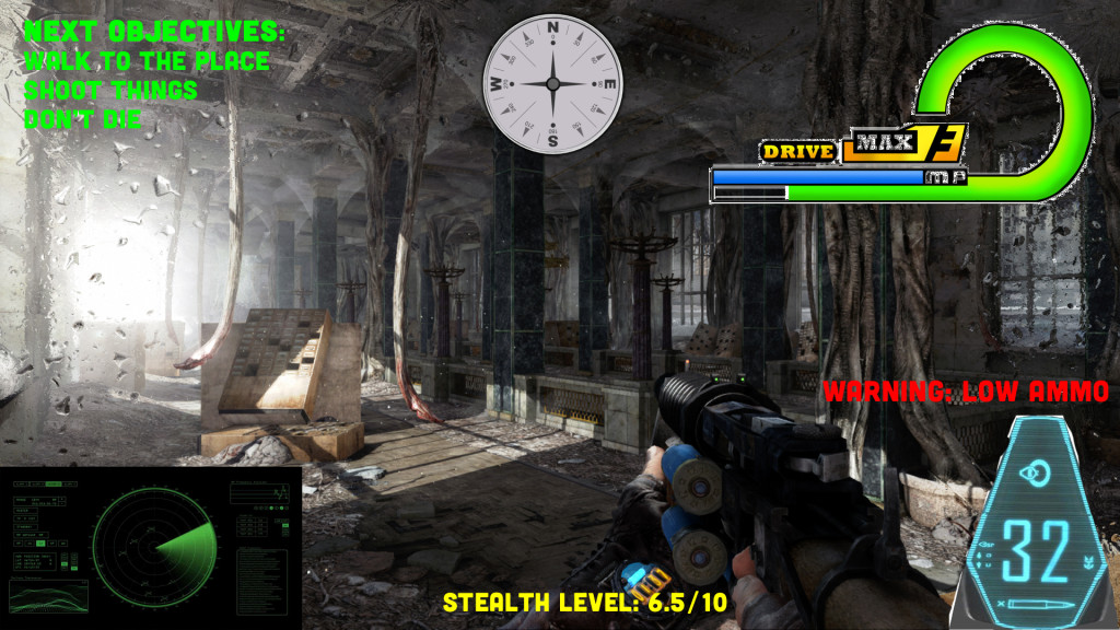
Here’s a terrible photoshop of what Metro 2033 might have looked like if it had the standard HUD.
A picture really is worth a 1000 words.
This realistic way to present information is carried over to the map and objective markers.
Once again this is a way of displaying data that does not conflict with the universe you inhabit. There is no information that YOU the player have access to, that your character does not also know. This creates a connection between you and your avatar, further drawing you into the world. There is no layer between you and the world you inhabit.
And no, it’s not just 1st person games that can strive to have a simple HUD. Here’s some great examples of 3rd person games that do an incredible job of keeping their screens uncluttered and still convey a lot of useful data.
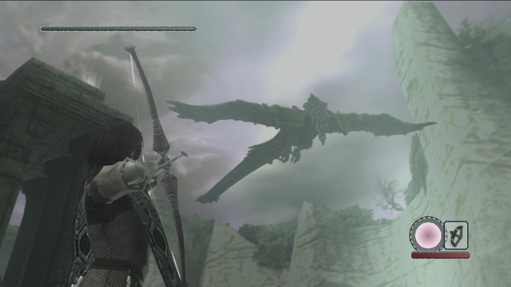
SHADOW OF THE COLOSSUS
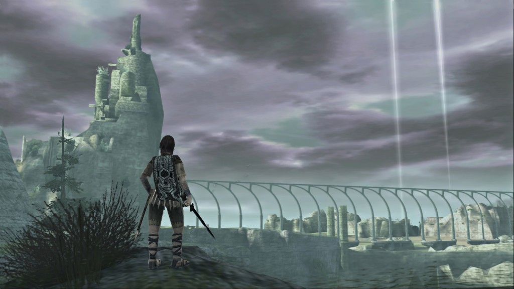
This HUD is simple and clean. The HUD only shows up when you are fighting – that way when you explore it looks like this:
When there is no data on screen you can fully take in the majesty and the loneliness of your surroundings.
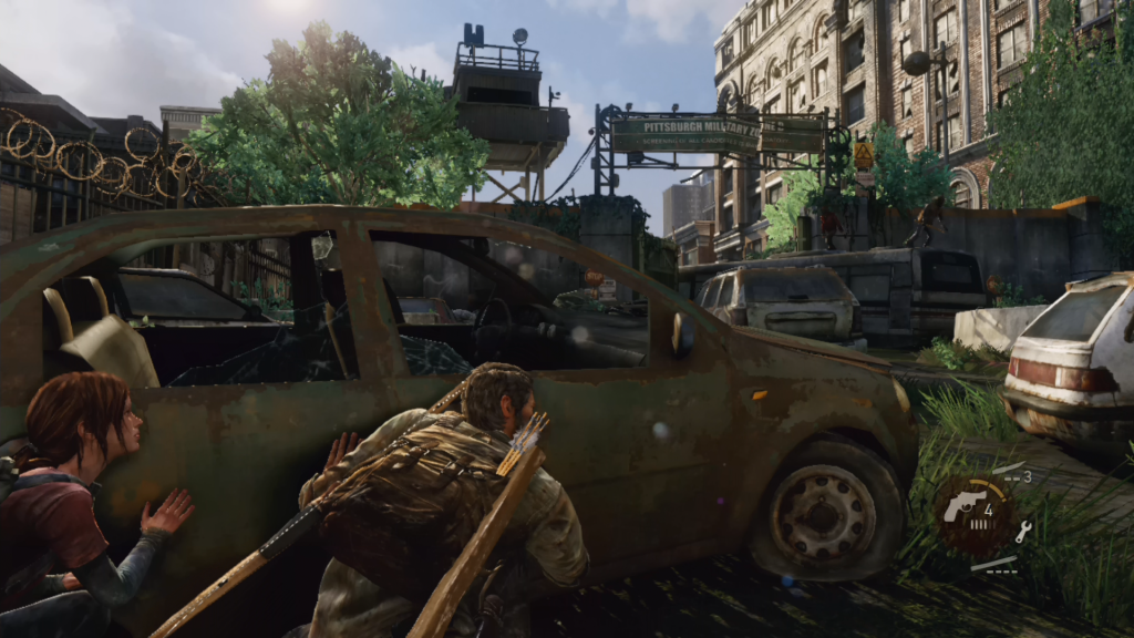
THE LAST OF US
Again, this HUD only appears when you are in combat, look at how LITTLE space it takes up! This allows the rest of the screen space to be used for the visuals.
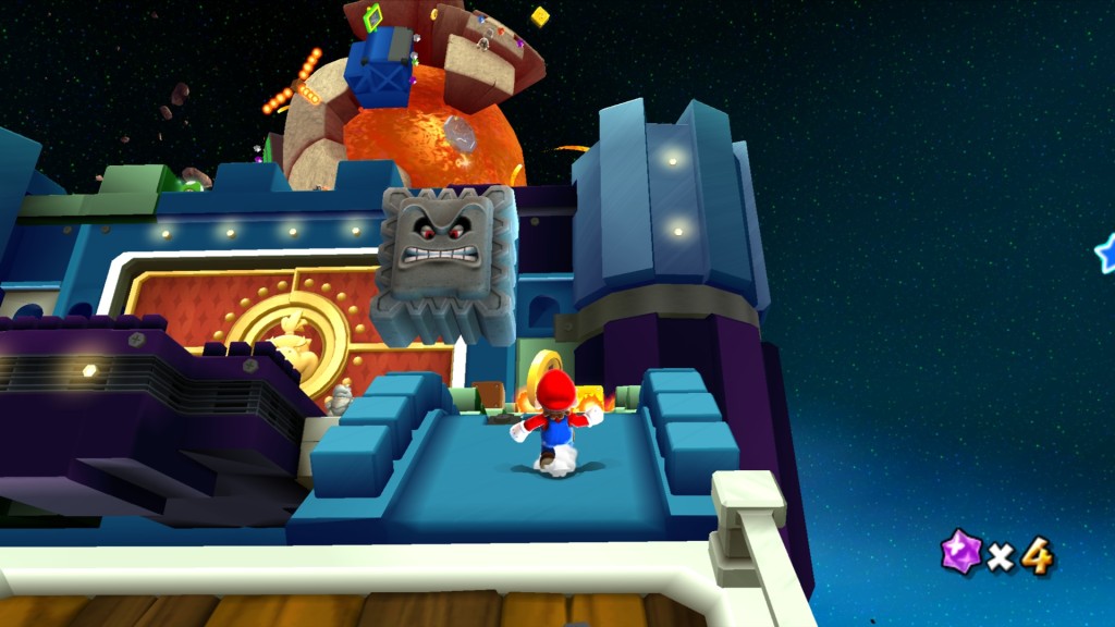
MARIO GALAXY 2
This HUD is more colorful to fit in the Mario universe. But it’s still simple, and it only displays information when something changes. If you get a coin, it shows your coins, if you get an extra life, it shows your total lives, and if you get damaged, it will show your remaining health. Otherwise, it keeps that info off the screen so you can feel engrossed in these enchanting worlds.
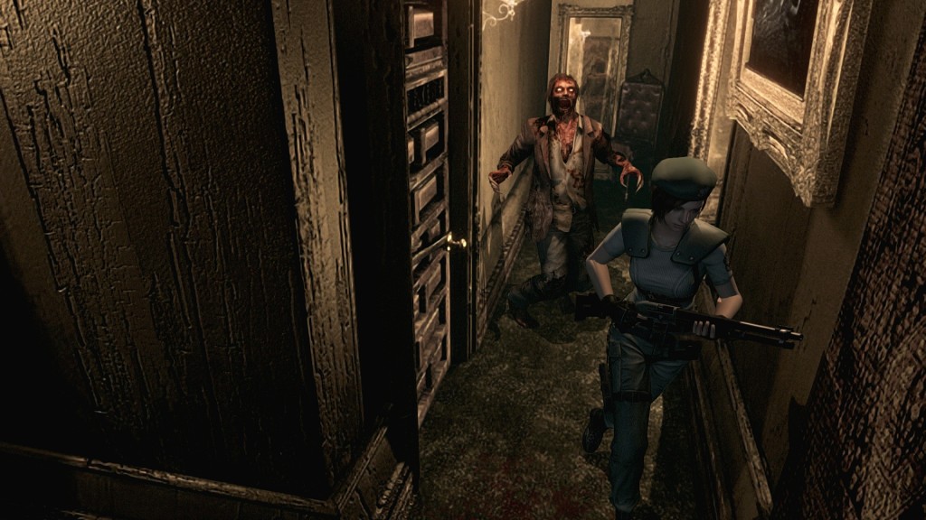
RESIDENT EVIL
There’s no screen HUD during the gameplay at all here. I think you get the point by now.
CONCLUSION
It pains me to see modern games squander their potential for immersion with button pressing gimmicks and intrusive HUDs. Technology and graphics have never been more powerful, and it has never been easier to create stunning virtual worlds that can transport us to fictional lands. Despite this, many developers have lost sight of this goal. By cluttering the screen with useless data, they create a wall between us and our stories. By displaying simple button prompts, they rob inquisitive players of any sense of accomplishment or exploration. Thankfully, many other developers from unknown indies to the heavy hitting brand-names are combating these trends, striving to create new, engrossing experiences for audiences.
I can’t say that every game should strive to be immersive. But immersion is a trait that video games are uniquely disposed to take full advantage of. In fact, it is this art form’s greatest strength. When a game leverages this unique strength to fully engage and engross an audience, it elevates the work above a simple diversion and becomes an interactive story that no other art form can match in intensity.


3 thoughts on “Press X To Immerse”